
 English
 Español
 عربى

 Home / Blog / Industry News / modern japanese interior design: Applications, Selection Criteria, and Practical Guidance

Industry News
modern japanese interior design: Applications, Selection Criteria, and Practical Guidance
2026-11-06
The quietest failure in a Japanese-style kitchen programme rarely shows up in the render. It shows up eight weeks later, when the matte oak doors arrive at 5 gloss units and the matching edge band arrives at 18 — and every cabinet front now wears a thin bright outline that nobody approved. Modern Japanese interior design is a low-contrast language, and low-contrast surfaces are unforgiving of small mismatches.
The conclusion first: in this style, finish matters more than pattern. Three numbers decide whether a room reads as Japanese or merely beige — gloss level (roughly 3–8 GU on vertical fronts), texture depth (a grain embossing you can feel at raking light, not just see at 1 m), and batch consistency between film and edge band (ΔE ≤ 1.0 inside one order). Get those right and almost any oak, stone or linen pattern will hold together. Get them wrong and even a premium veneer looks like a laminate.
- Low gloss before low colour — matte is the structural choice, palette is the cosmetic one.
- Texture carries the wood; the print only supplies the tone.
- Film, edge band and adhesive should come from one production run, not three purchase orders.
Content
Four Material Rules Behind the Look
Strip away the styling and the aesthetic rests on how surfaces behave under daylight. These four rules translate most directly into purchasing decisions.
1. Light is the material
Shoji screens and paper diffusers are why the style tolerates so little glare. A 30 GU door facing a window throws a hard highlight across the room and breaks the calm. Specify matte on the surface that receives the most light, and reserve any sheen for surfaces the sun never hits directly.
2. Depth beats colour
A smoothly printed grain reads as plastic the moment a hand touches it. Synchronised pore embossing — where the texture register matches the printed grain — is what makes a 0.3 mm film survive close inspection.
3. One batch, one order
Colour drift between production lots is the single most common claim source on low-contrast schemes. Book film and edge band together and keep the master sample sealed.
4. Accent by material
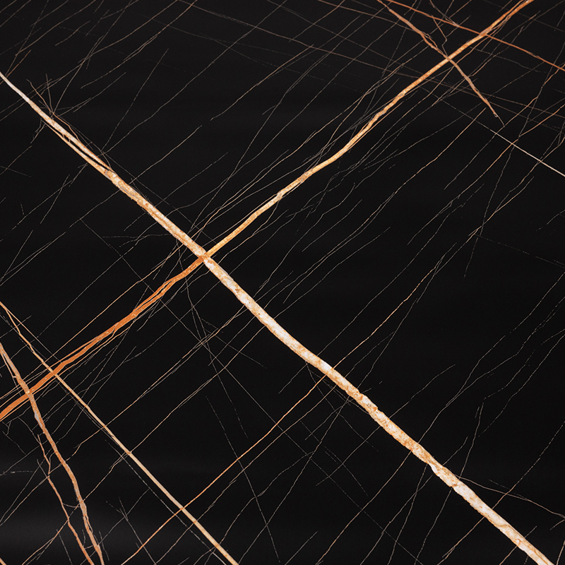
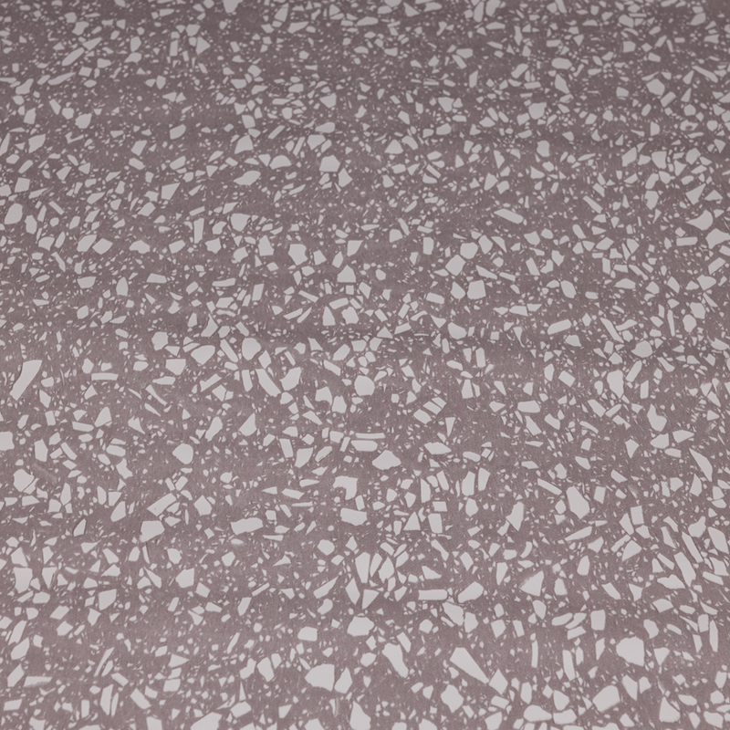
The style rarely accents with strong colour; it accents with substance — brushed metal, terrazzo, linen weave, warm grey stone. Decorative film portfolios cover all four in the same thickness range, which is what allows one door programme to mix them.
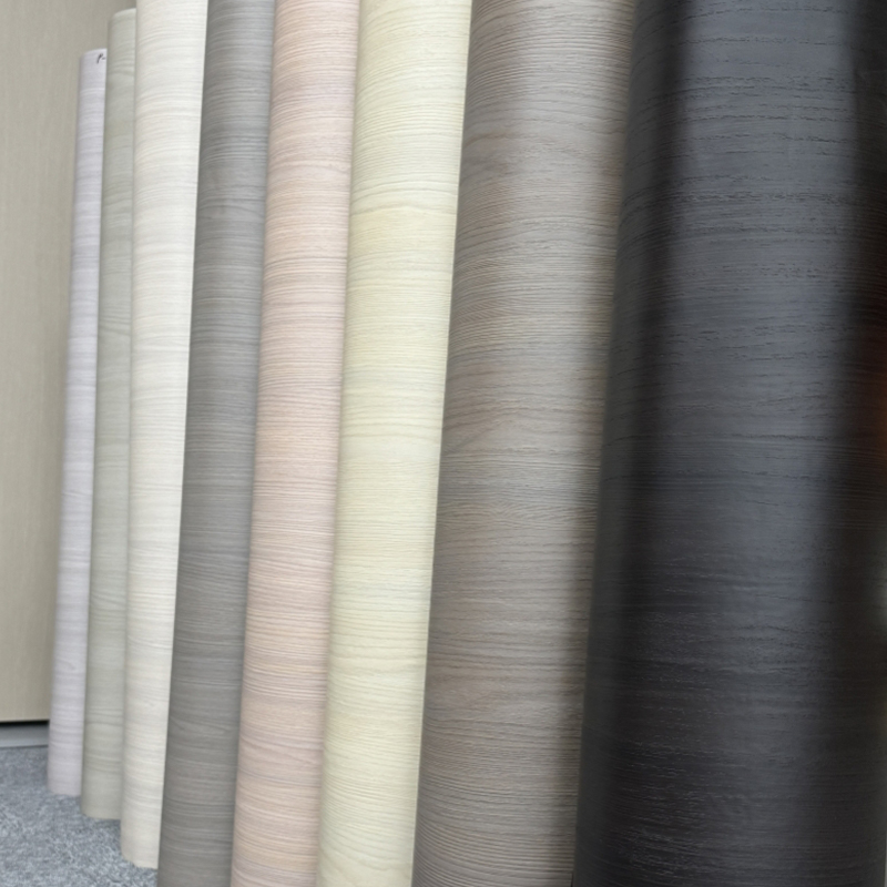
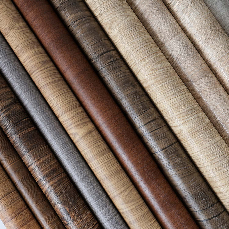
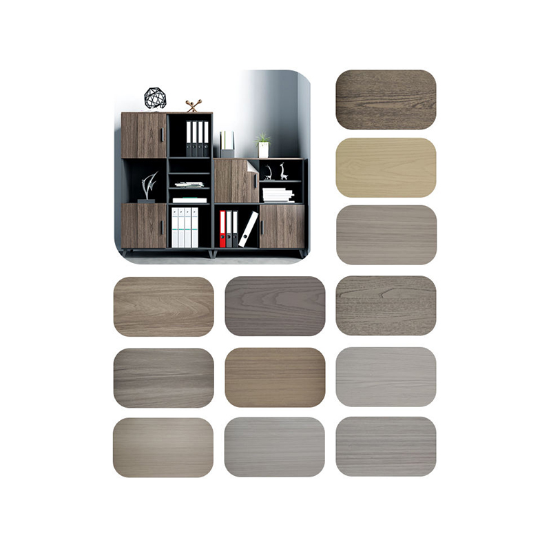 Grey-Tone Wood Grain PET Decorative Film for CabinetsGrey and misty grey oak PET film with clear grain definition for cabinets and bookcases; a PET option to compare against PVC and PP.View Product →
Choosing the Base Film: A Side-by-Side Comparison
The same oak image behaves differently on PVC, PP and PET, because the base resin sets the gloss ceiling, the press window and the recyclability story. Below is the working comparison we use when a customer asks which substrate suits a Japanese-minimal programme.
Substrate
Gloss (GU)
Texture range
Best fit
Watch out for
Standard PVC
3–30
Wood, stone, fabric
General cabinet fronts
Plasticiser migration with some adhesives
Water-based skin-feel PVC
2–5
Fine grain, soft touch
Handle-heavy doors, wardrobes
Fingerprints need a matte-safe cleaner
PP
5–25
Wood, concrete, terrazzo
Recyclable programmes, wet rooms
Lower heat tolerance in pressing
PET
5–40
Wood, solid colour, gloss
High-wear fronts, colour programmes
Cost premium, tighter press window
Indicative ranges only — confirm gloss and texture values against the supplier data sheet, and always approve against a physical master sample rather than a screen. For a deeper material comparison, see PET versus PVC decorative film.
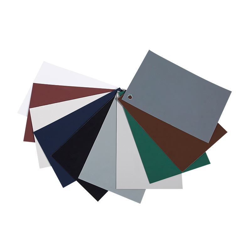
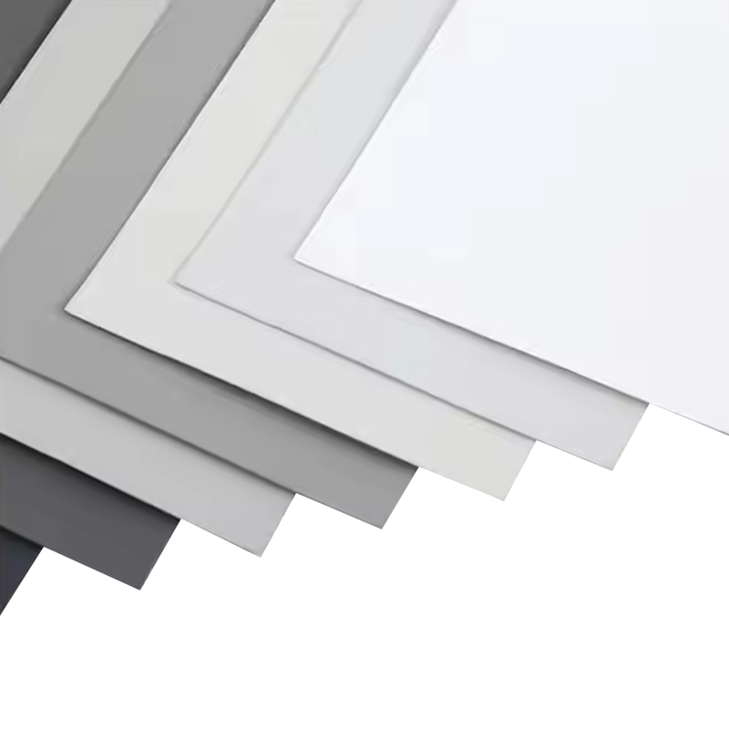
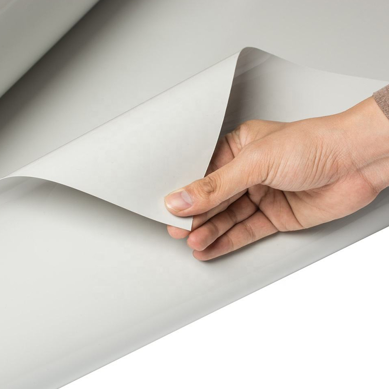
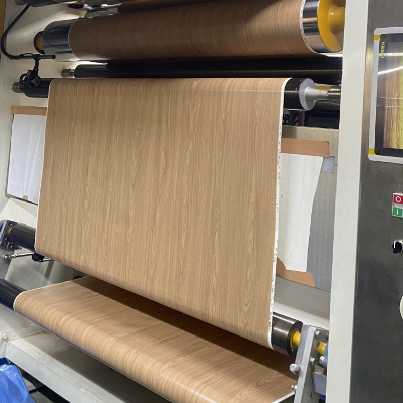 Super Matte Soft Touch PVC Decorative FilmPure-color PVC film with a matte, skin-like soft-touch finish for furniture and interior surfaces; useful when reviewing finish handling and claim risk.View Product →
The Hidden Metric: Rework Risk by Finish
Purchasing teams track price per square metre and ignore the number that actually moves margin: how often a finish comes back. The index below ranks finishes by combined handling, matching and claim risk on a 0–10 working scale. It is a practical planning tool built from shop-floor observation, not published industry statistics — validate it against your own claim log before you quote.
High-gloss solid (9)
Soft-touch matte (7)
Fabric texture (6)
Matte wood grain (4)
Synchronised grain (3)
The pattern is consistent: the further a surface moves from the middle of the gloss range, the more it costs to protect. High-gloss solid colours show every handling mark and every lighting inconsistency, while synchronised textured grain hides them. That is why a minimal Japanese scheme — which sits deliberately at the matte end — is often cheaper to run than a high-gloss one, even when the film itself costs more per roll.
Where the Volume Actually Goes
Decorative film is often spoken about as one product. In practice the demand splits sharply by application, and each slice has different specification priorities. The split below is an indicative allocation across a typical residential project portfolio; use it to sanity-check where your own order book sits.
- Cabinet doors and fronts — 46%, driven by gloss and edge match
- Wall and renovation film — 20%, driven by adhesion and air release
- Flooring — 16%, driven by wear layer and moisture resistance
- Doors and panels — 11%, driven by wrapping stretch and corner hold
- Exterior and other — 7%, driven by UV and heat cycling
The practical takeaway: the front-facing slice dominates, so a single gloss decision on doors decides the perceived quality of the entire project. Wall film is a different product with a different failure mode — bubbling, not colour drift — and should never be bought on the same specification sheet.
A Selection Sequence That Survives the Shop Floor
Most specification errors come from choosing in the wrong order — pattern first, process last. Reverse it.
Step 1 — Fix the gloss target. Decide matte or soft-touch per surface before you look at a single decor. Every later step depends on it.
Step 2 — Match the process. Flat lamination, vacuum pressing and profile wrapping each demand different thickness and stretch. A 0.3 mm film that wraps a radius well may press poorly.
Step 3 — Lock the edge band. ABS for durability and colour depth, PVC for cost. Order it with the film, in the same lot, from the same decor reference.
Step 4 — Run a scrap trial. Your adhesive, your press cycle, your climate. Two panels, one week of waiting, and you avoid a container-level dispute.
Step 5 — Approve under the real light. Sign the master sample in the room or a daylight-matched booth, then seal it. Screen approvals are the origin of most colour arguments.
Maintenance, Compliance and the Long Tail
A minimal interior shows every mark it is allowed to keep, so cleaning guidance belongs in the handover pack, not the brochure.
- Clean with pH-neutral detergent and a microfibre cloth. Abrasive cream cleaners will dull a super-matte face permanently within a few passes.
- Keep solvents away from water-based skin-feel coatings; they soften the surface layer rather than merely marking it.
- On self-adhesive wall film, test patch adhesion on painted plaster first — fresh emulsion and dusty substrates are the usual cause of edge lift.
- For export programmes, confirm low-VOC and heavy-metal declarations, plus fire classification where commercial interiors are involved.
- If recyclability is part of the pitch, PP and PET carry a cleaner story than plasticised PVC — and the claim has to survive the customer's own audit.
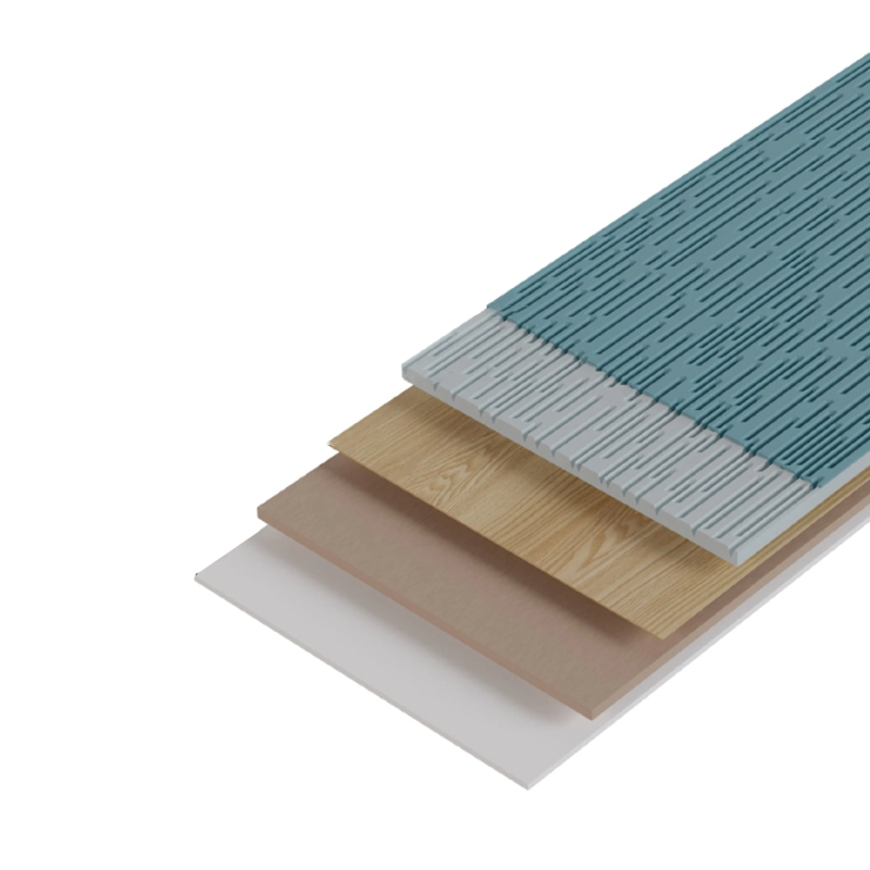
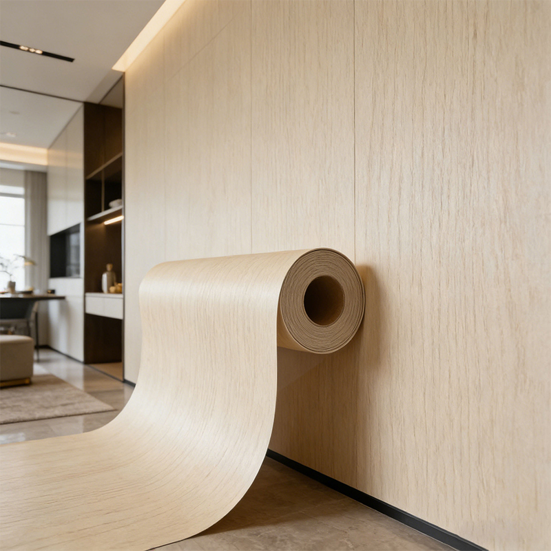 Light Oak Wood Grain Self Adhesive Decorative FilmSelf-adhesive light oak film with realistic, fade-resistant grain for wall panels; easy-clean surface suits minimal interiors where marks and upkeep matter.View Product →
Finally, ask how the film is actually made. Vertical integration — resin, calendering and coating under one roof — is the difference between a decor reference that holds for years and one that quietly shifts between shipments. Our manufacturing process is documented for exactly that reason.
Recommended Articles
-
1.1 What is PP Decorative Film? PP decorative film is a type of surface material made primarily from polypropylene, a versatile and widely used thermoplastic po...
View More -
Is your furniture looking tired, outdated, or damaged? Imagine transforming it effortlessly into something stunning, durable, and uniquely yours. Enter PVC deco...
View More -
1.Introduction Edge banding is a crucial finishing process used in woodworking and furniture manufacturing to cover and seal the exposed sides of materials such...
View More
Xuanyi

Feel free to contact us
Xuanyi, dedicated to the application and research and development of new materials. Furniture Decorative Film Maufacturers and Factory.
Product Fast Links
Contact Information
-
 Room G, 4th Floor, Bailingshi Building, Haizhou Street, Haining City, Jiaxing City, Zhejiang Province, 314400, China
-
 [email protected]
-
 +86-15059290610
-
 +86-15059290610
Copyright © 2024Jiaxing Xuanyi International Trade Co.,Ltd All Rights Reserved. PVC/PP/PET Lamination Film for MDF WPC Plywood

