
 English
 Español
 عربى

 Home / Blog / Industry News / Mixing Warm and Cool Wood Tones: A Practical Guide for Furniture Makers

Industry News
Mixing Warm and Cool Wood Tones: A Practical Guide for Furniture Makers
2026-11-02
Content
- 1 The Short Answer: Dominance Beats Perfect Matching
- 2 What Warm and Cool Mean in a Wood-Grain Decorative Film
- 3 Comparing Three Common Warm-Cool Pairings
- 4 Lighting Changes the Verdict More Than the Sample Board Does
- 5 Where Mixed-Tone Wood Grain Surfaces Appear Most
- 6 A Five-Step Selection Flow for Furniture Programmes
- 7 Maintenance, Compliance and the Details That Protect the Design
- 8 Specify the Relationship, Not Just the Colour
The Short Answer: Dominance Beats Perfect Matching
A honey-oak cabinet run paired with a grey-washed ash island can look deliberate, but only when one tone clearly leads. The common failure is not the presence of warm and cool wood tones; it is giving both tones equal visual weight and expecting the room to resolve the conflict.
Working conclusion: choose a roughly 70/30 dominant-to-accent split, repeat each wood tone at least twice, bridge the pair with a neutral material, and approve the combination under 2700K, 3500K and 5000K lighting. For furniture production, also lock the decorative film and edge-band colour deviation before the first panel is pressed.
The practical impact is commercial. A two-tone kitchen that reads as one composition can justify a premium finish; a mismatched pair reads as inventory leftovers. That is why designers, specifiers and production teams should treat warm-cool mixing as a specification problem, not a taste problem.
What Warm and Cool Mean in a Wood-Grain Decorative Film
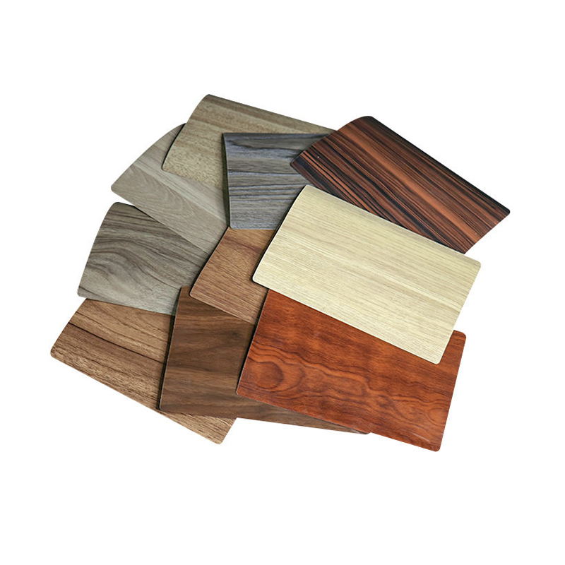
Warm woods usually carry yellow, red or orange undertones: honey oak, cherry, natural maple and many walnut faces. Cool woods lean grey, blue or violet: grey-washed ash, espresso, weathered teak and some smoked oak finishes. Neutral bridges include white oak with a taupe wash, walnut with low red saturation, and non-wood materials such as black metal, white lacquer or warm grey stone.
Undertone first
Match the base colour family before matching the species name. A red-brown cherry and a grey-brown ash can sit together when both carry a muted, low-chroma base.
Value contrast
A light warm oak next to a dark cool espresso is easier to read than two mid-tone woods fighting at the same value. Keep at least one clear light-dark step.
Sheen and texture
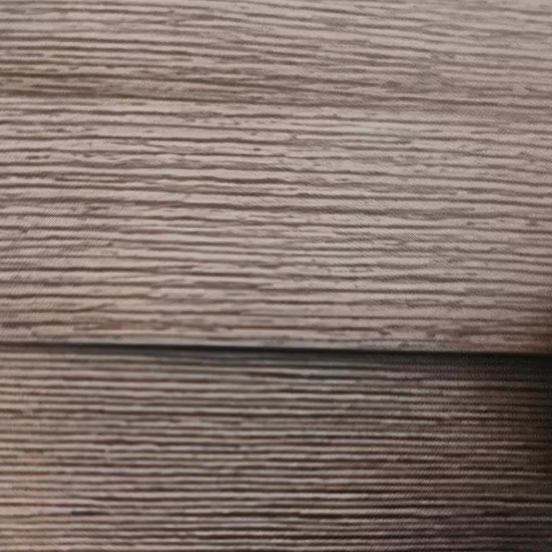
A matte 5-8 GU surface and a high-gloss 80+ GU surface can share a colour family but still look unrelated. Texture depth and embossing also change how warm or cool a grain appears.
Repetition
One cool ash table in a warm oak room can look accidental. Repeat the cool tone in a second place—an edge band, a shelf, a door frame—so the eye accepts it as a pattern.
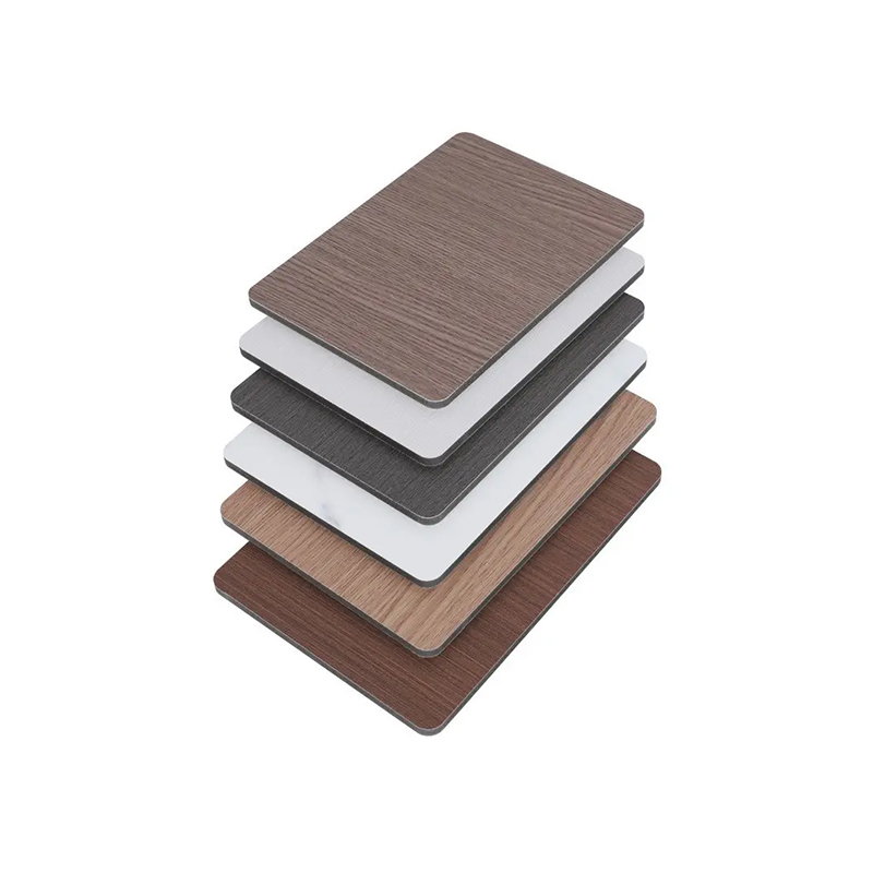
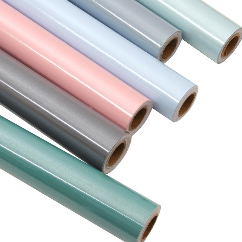
In production, the same nominal wood tone can shift across PVC, PP and PET films because the base polymer, print layer and top coat affect light reflection. A grey-tone PET film developed for cabinets will often read cooler and cleaner than a warmer PVC foil with the same grey-brown print. That is useful when the design needs a cool accent, but it must be checked against the dominant warm surface before approval.
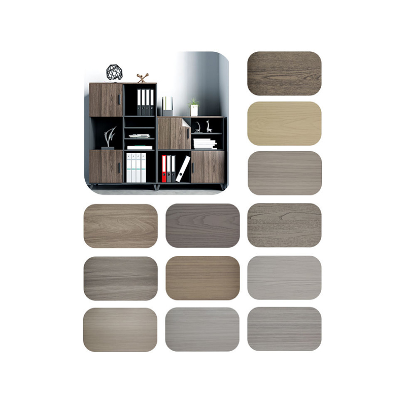 Grey-Tone Wood Grain PET Decorative Film for CabinetsGrey-Tone Wood Grain PET Decorative Film for Cabinets is developed specifically for the grey-furniture design trend that has grown across office and home furniture in ...View Product →
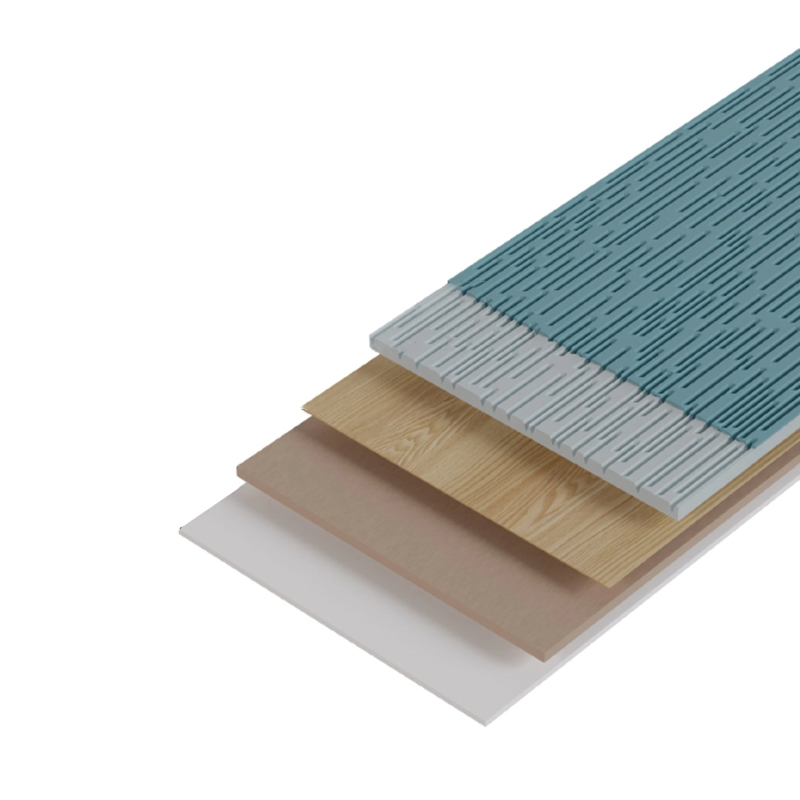
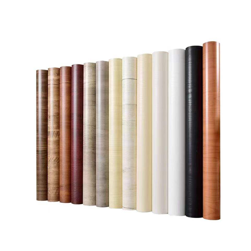
For the warm side of the palette, a wood-grain PVC decorative film gives furniture makers a broad route to honey oak, cherry and natural maple looks with predictable lamination behaviour. The key is to approve the warm and cool candidates as a pair, not as isolated swatches.
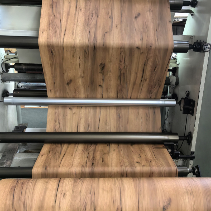 Wood Grain PVC Decorative FilmWood grain PVC decorative film is a high-simulation surface material made from polyvinyl chloride (PVC) through calendering or coating processes, combined with wood gr...View Product →
If the project mixes PVC, PP and PET surfaces, use a broader material comparison before locking the palette. The differences in gloss, scratch resistance and heat behaviour matter as much as the printed grain.
Comparing Three Common Warm-Cool Pairings
The table below uses a div-based layout so the comparison stays stable in a CMS. Treat the tolerance figures as practical working targets, not universal standards.
Table note: ΔE00 is a colour-difference metric. A tighter tolerance is needed when two surfaces touch; a wider tolerance is acceptable when a neutral bridge separates them.
Lighting Changes the Verdict More Than the Sample Board Does
Warm and cool wood tones are not fixed under every light source. A pair that looks balanced in a north-facing showroom can separate sharply under 2700K retail lighting, while a 5000K inspection booth exposes grey and blue undertones that were invisible on the desk. This is metamerism in practice, and it is why sample boards should travel with a lighting note.
82
2700K
48
3500K
67
5000K
The indexed bars show relative mismatch risk, not a physical unit. Warm retail light tends to amplify yellow and red undertones, making a cool grey accent look more isolated. Neutral 3500K lighting is usually the most forgiving for mixed wood programmes. Cool 5000K light reveals blue-grey casts and is useful for final inspection, but it can make a warm oak look more orange than it will in a home.
The practical rule is simple: approve the palette under at least three colour temperatures and two light levels. If the project has a strong daylight component, include a north-facing window check. If it is a retail fit-out, include the actual track-light CCT. Do not rely on a single photograph or a single showroom visit.
Where Mixed-Tone Wood Grain Surfaces Appear Most
Mixed warm and cool wood tones show up most often in kitchen cabinetry, followed by wardrobes and wall panels. The distribution below reflects typical furniture and interior programmes rather than a single market study, but it helps production teams prioritise sample development and quality checks.
Kitchen cabinets: 38%
Wardrobes: 24%
Wall panels: 18%
Flooring: 12%
Other: 8%
Kitchens dominate because a two-tone island-and-perimeter layout naturally creates a dominant tone and an accent tone. Wardrobes often use a warm wood door with a cool grey frame or interior. Wall panels allow larger areas of contrast but punish gloss mismatch. Flooring is more conservative: most projects keep one dominant wood tone and use rugs or furniture as the cool accent. For a deeper comparison of film chemistries and surface performance, the PVC, PP and PET film selection guide is a useful reference for specifiers.
A Five-Step Selection Flow for Furniture Programmes
A repeatable flow reduces the chance that a beautiful sample board becomes a costly production dispute. The sequence below works for kitchen cabinets, wardrobes, wall panels and flooring film programmes.
- Lock the dominant tone. Decide whether warm or cool owns the largest surface area. Write it into the specification with a percentage range, not a vague preference.
- Map the undertones. Compare chroma, not just species. A low-chroma warm wood and a low-chroma cool wood are easier to bridge than two highly saturated faces.
- Set film and edge-band tolerances. For touching surfaces, target ΔE00 ≤ 1.0 and test the edge band against the film, not only against the sample chip. Check 0.5 mm and 1.0 mm edge profiles under the same light.
- Test lighting and texture. View the pair at 2700K, 3500K and 5000K. Confirm that gloss, embossing and grain scale support the intended contrast rather than fighting it.
- Lock the batch and documents. Record the film lot, edge-band lot, gloss reading and colour approval. Keep a physical approved sample with the lighting note attached.
Edge banding is often the hidden failure point. A cabinet door can pass the film check and still fail at the edge because the banding is more saturated, glossier or slightly cooler than the face film. Matte wood-grain ABS edge banding helps keep the warm-cool relationship controlled on visible edges, especially when the design uses a cool frame against a warm door.
 Matte Wood Grain ABS Edge BandingMatte Wood Grain ABS Edge Banding reproduces natural timber texture in a soft, non-reflective finish for furniture styles that call for a warm, understated look. Color...View Product →
The purchasing risk is not only a colour reject. It is schedule loss from re-sampling, extra setup time and a mixed batch that cannot be sold as a matching programme. Tight tolerances at the sample stage are cheaper than sorting finished panels.
Maintenance, Compliance and the Details That Protect the Design
Once the palette is approved, maintenance and documentation determine whether the mixed-tone effect survives daily use. Decorative films are not maintenance-free, but they are predictable when the surface and edge details are specified correctly.
- Clean with a neutral pH detergent and a soft cloth. Avoid abrasive pads and solvent-heavy cleaners on matte or soft-touch surfaces.
- For high-use cabinets, specify anti-scratch films and check the edge-band adhesion after trimming. A lifted edge collects dirt and makes a colour mismatch more visible.
- For exterior or UV-exposed surfaces, use UV-resistant films and request UV stability data. Indoor films should not be assumed to perform on exterior doors or window-facing panels.
- Ask for batch colour records, VOC or indoor-air-quality test reports where relevant, and material compliance documents for the destination market. Keep the approved sample and lot number with the project file.
- Verify the supply chain before scaling a palette. A manufacturer with in-house calendering and coating can often control film consistency more tightly than a trader sourcing from multiple lines; the manufacturing capability overview is the place to check process scope and quality controls.
Compliance also affects colour choice. Some markets restrict certain pigments or surface treatments, and a warm red-brown may be easier to document than a complex grey-blue effect. Confirm the target market requirements before the design is frozen, not after the first container is packed.
Specify the Relationship, Not Just the Colour
Mixing warm and cool wood tones works when the specification describes a relationship: a dominant tone, an accent tone, a neutral bridge, a repetition pattern and a measurable tolerance. That is more useful than naming two wood species and hoping the room agrees. For furniture makers, the film and edge band are part of the design, so they belong in the same approval loop as the cabinet door and the wall panel.
A practical close-out package should include the approved film swatch, the matching edge-band sample, the gloss reading, the lighting conditions used for approval and the batch record. With those controls in place, a warm oak and a cool grey ash can read as a considered composition rather than a colour accident.
Recommended Articles
-
1.1 What is PP Decorative Film? PP decorative film is a type of surface material made primarily from polypropylene, a versatile and widely used thermoplastic po...
View More -
Is your furniture looking tired, outdated, or damaged? Imagine transforming it effortlessly into something stunning, durable, and uniquely yours. Enter PVC deco...
View More -
1.Introduction Edge banding is a crucial finishing process used in woodworking and furniture manufacturing to cover and seal the exposed sides of materials such...
View More
Xuanyi

Feel free to contact us
Xuanyi, dedicated to the application and research and development of new materials. Furniture Decorative Film Maufacturers and Factory.
Product Fast Links
Contact Information
-
 Room G, 4th Floor, Bailingshi Building, Haizhou Street, Haining City, Jiaxing City, Zhejiang Province, 314400, China
-
 [email protected]
-
 +86-15059290610
-
 +86-15059290610
Copyright © 2024Jiaxing Xuanyi International Trade Co.,Ltd All Rights Reserved. PVC/PP/PET Lamination Film for MDF WPC Plywood

